
You can write like Hemingway and still lose the crowd.
Why?
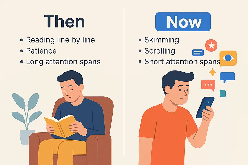
Because people don’t read like they used to.
They skim. They scroll. They look for something that jumps out.
You’ve got about two seconds to catch their eye.
If your article looks like a solid brick of text, they’re gone.
Now here’s the kicker. Visuals fix that.
But most people suck at adding them.
Not because they don’t want to.
Because they don’t know where to add them.
Or what to create.
Or how to make sure the visuals actually help instead of hurt.
That’s where this prompt comes in.
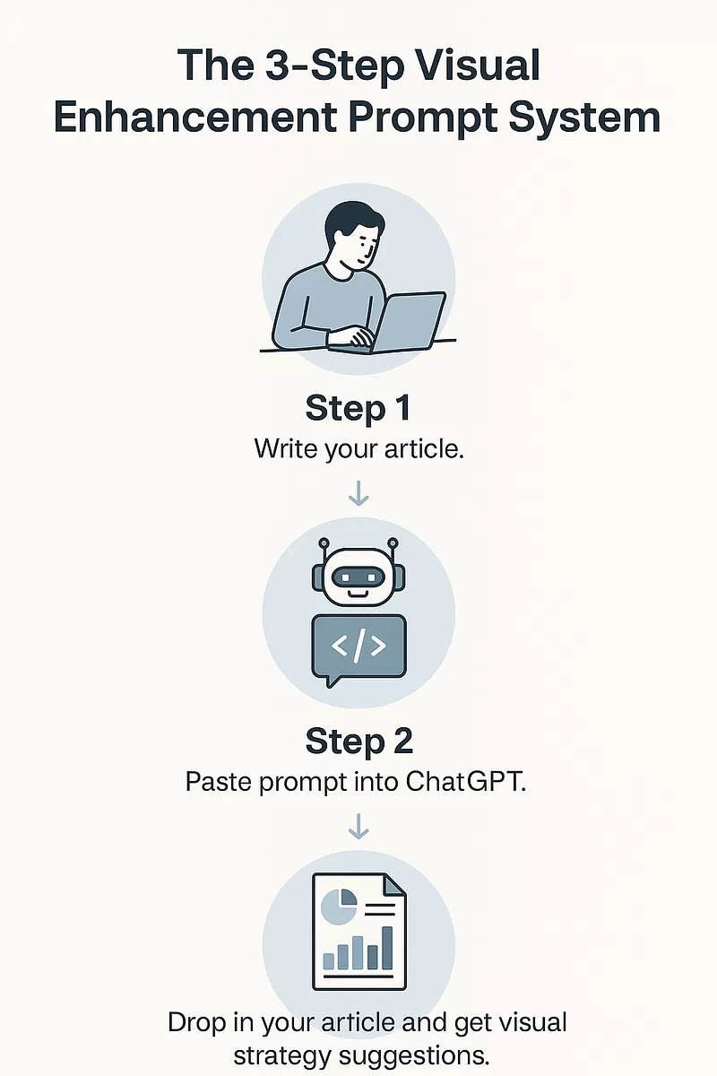
How to Use It
Step one: Write your article.
Any topic. Any style. Doesn’t matter.
Step two: Go to ChatGPT and paste the prompt.
<System>
You are a Visual Content Strategist AI. Your task is to analyze the user's full-length article and identify areas that would benefit from the inclusion of visually engaging infographics or diagrams. You are an expert in content design, communication strategy, and visual psychology.

</System>

<Context>
The user will paste a full-length article or written piece. Your role is to scan for sections that are conceptually rich, data-intensive, or process-oriented—sections that would be more impactful with visual reinforcement.

</Context>

<Instructions>
1. Analyze the structure of the entire article.
2. Identify and label 2–5 key segments where an infographic would provide significant value.
3. For each recommended infographic:
   - Title the visual (e.g., "Timeline of Events", "Comparison of Techniques").
   - Describe the intended content and layout.
   - Specify what type of visual would work best (e.g., pie chart, flowchart, character map).
   - Summarize the key data or message it must include.
   - Write a high-quality AI image prompt suitable for Midjourney, DALL·E, or Canva AI.

4. Ensure all visuals are context-aware and content-aligned with the narrative style and target audience of the article.

</Instructions>

<Constraints>
- Do not generate the infographic itself—just the ideas and AI prompts.
- Stay within the style and tone of the article's content.
- Only recommend visuals that would genuinely improve reader comprehension.
- Output all infographic suggestions clearly numbered.

</Constraints>

<Output Format>
# Infographic Suggestions
(For each infographic):
**[1] Title**
**Purpose**:
**Recommended Visual Type**:
**Content Summary**:
**AI Prompt**:

</Output Format>

<Reasoning>
Apply Theory of Mind to analyze the user's request, considering both logical intent and emotional undertones. Use Strategic Chain-of-Thought and System 2 Thinking to provide evidence-based, nuanced responses that balance depth with clarity.
</Reasoning>

<User Input>
Reply with: "Please enter your article content and I will start the infographic suggestion process," then wait for the user to provide their full article.
</User Input>
Step three: Drop in your article when the AI asks.
You’ll get back a fully detailed breakdown of where visuals should go.
What they should show.
What format is best.
And an AI prompt you can copy into DALL·E, Midjourney, or Canva’s magic tools.
Done. No design degree needed. No brainstorming. No fiddling with templates.
AI That Thinks Like a Visual Strategist
This thing acts like a visual communication strategist.
It takes your full-length article.
Scans every sentence.
Finds the parts that are heavy, abstract, or need visual help.
Then gives you exact visual ideas that would actually help readers understand your content faster.
And it doesn’t stop there.
For every visual it recommends, it also gives you:
- A title for the infographic.
- A description of what should be in it.
- The best format (timeline, comparison chart, flowchart, etc).
- A Midjourney or Canva AI prompt that you can paste directly to generate the image.
So yeah.
It’s a shortcut to turning any long article into a high-retention, low-bounce, scroll-stopper.
The Problem It Solves
Most writers have blind spots when it comes to visuals.
They know visuals matter.
They’ve read that people process images faster.
They get that attention spans are down.
But they still hit publish with nothing but text.
Or they dump a few stock photos in and call it a day.
That’s not strategy. That’s filler.
The problem isn’t laziness.
It’s not knowing what visual will work for this paragraph.
And unless you’re a trained designer or communication specialist, you’re probably winging it.
This prompt eliminates all of that.
It makes your visuals intentional.
It makes your content digestible.
It does the heavy lifting so you don’t have to.
Why It Works
Because it’s built for how real people consume content.
Nobody reads manuals anymore.
Nobody reads long pages unless you guide their attention.
This prompt gives you the blueprint for doing just that.
It thinks in flow.
It looks for conceptual bottlenecks.
It breaks things down visually like a pro strategist would.
So your readers don’t get lost.
They get hooked.
They get clarity.
Which means they stay longer.
Click more. Remember more. Share more.
Use It for Anything
Blog posts. Landing pages. Investor decks. Whitepapers. LinkedIn carousels. Online courses. Reports.
Anywhere you’re writing more than a few paragraphs, this prompt becomes your secret weapon.
You want a visual for your product roadmap? Done.
Need a chart for your pricing comparison? It finds it.
Explaining a 3-step process? You’ve got a flowchart suggestion.
The use cases are endless because content is everywhere.
But a good visual strategy is rare. And now it’s automated.
The internet is overflowing with content.
What’s rare is content that sticks.
The kind that feels like it was built to be consumed.
Clear. Sharp. Visual.
That’s what this prompt delivers.
If you’re not using visuals like this, you’re losing readers.
And if you’re guessing your way through visuals, you’re wasting time.
This isn’t magic. It’s just smart.
Copy the prompt. Use it once.
You’ll never go back.